 Milks and Dairies
 Clothing & beauty
 Pet Toy
 Baking material
 Fresh Fruit
 Wines & Drinks
 Fresh Seafood
 Fast food
 Vegetables
 Bread and Juice
 Cake & Milk
 Coffee & Teas





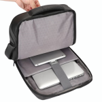
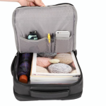
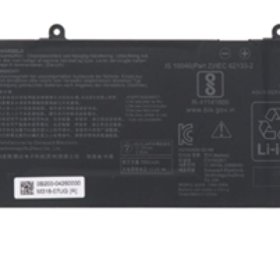
Asus X1605Z C31N2201 Internal Original
₪342.00
₪380.00


1900 - 88824/7 Support Center
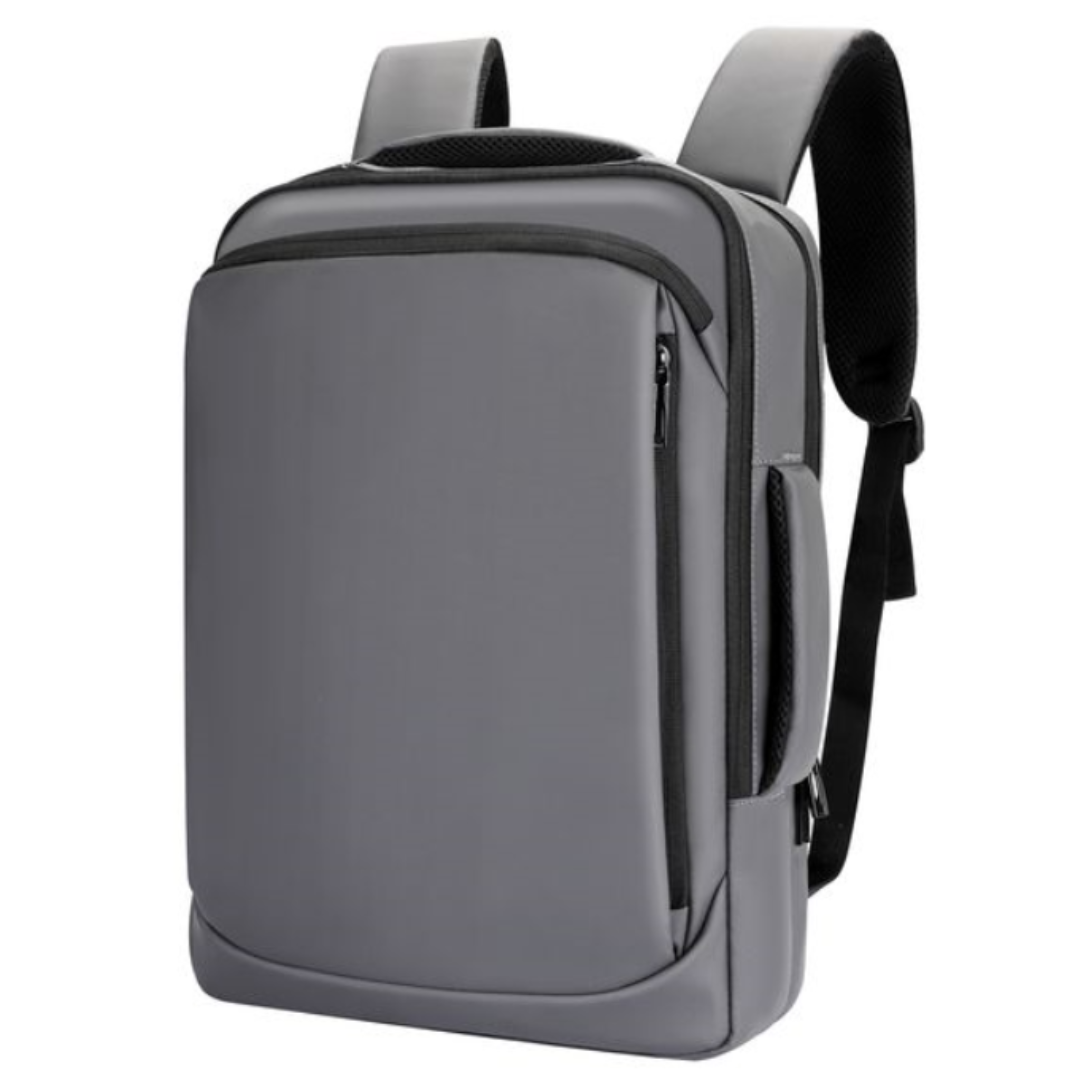
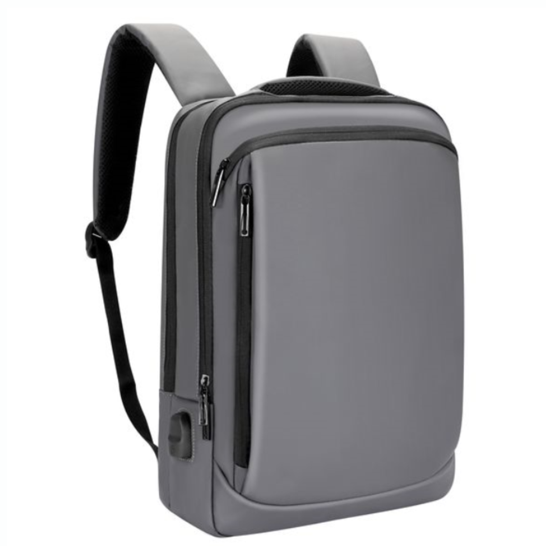
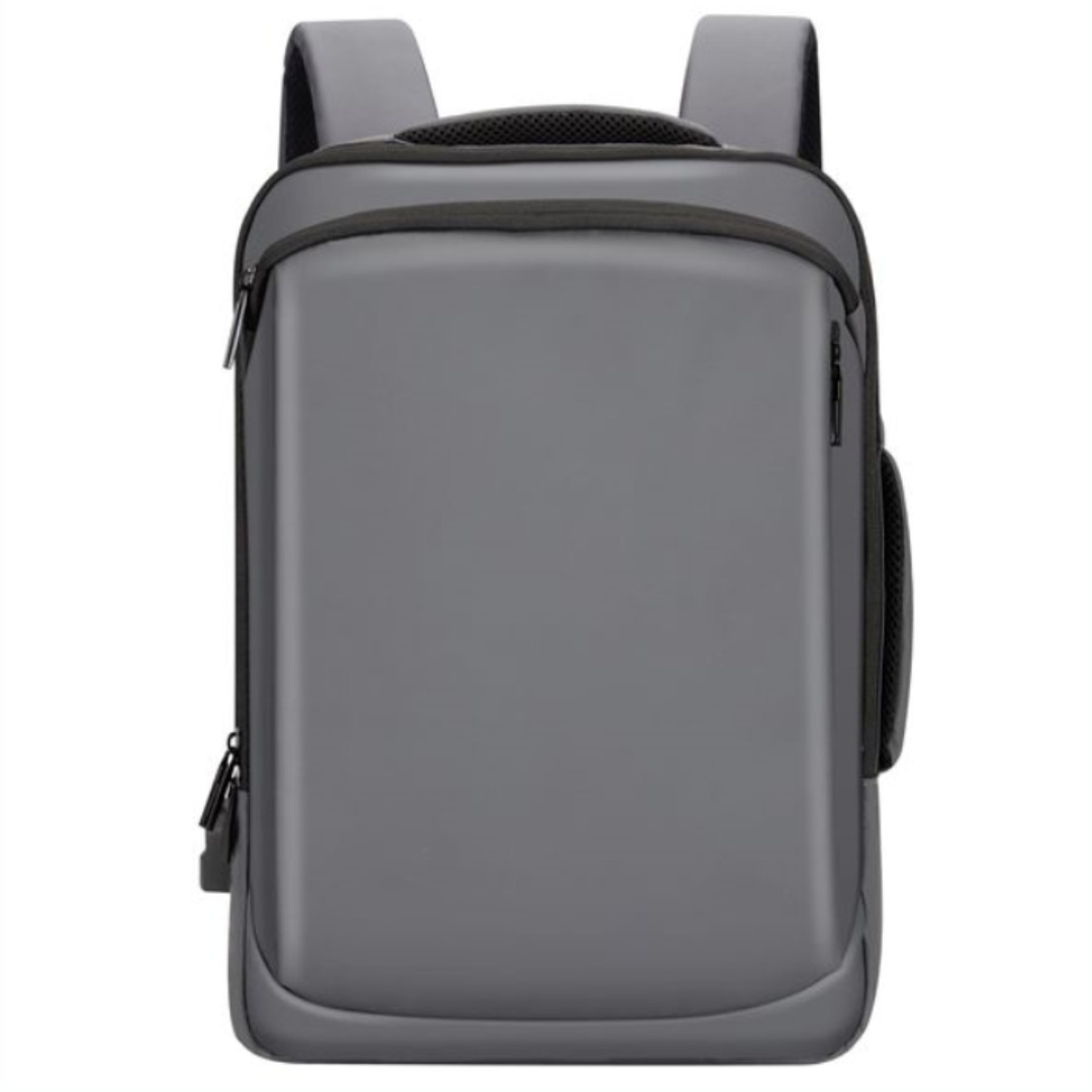
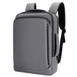
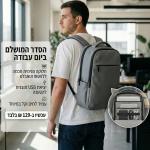
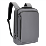
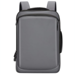
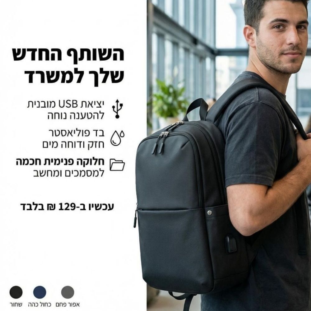
דגם Tom
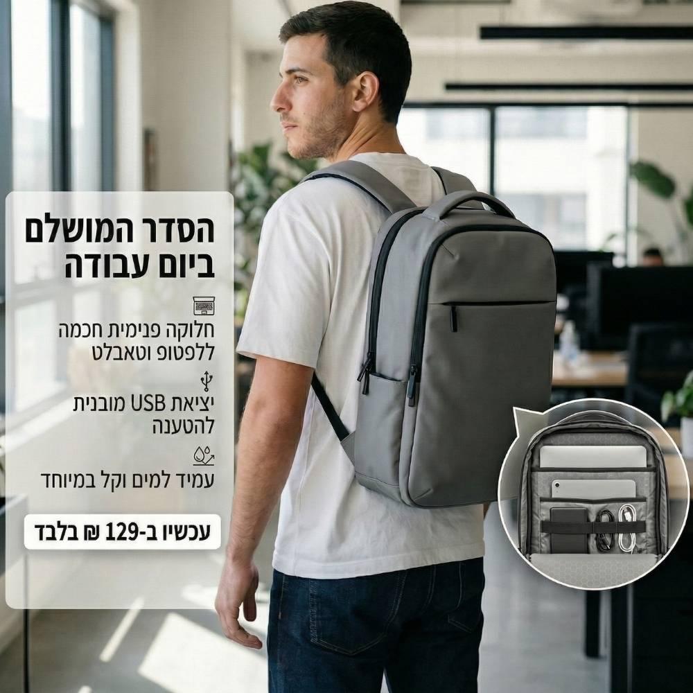
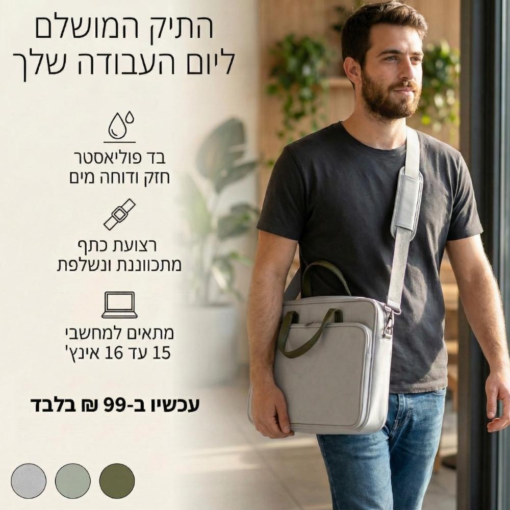
• תיק גב מעוצב ואופנתי, מתאים למחשבים ניידים.
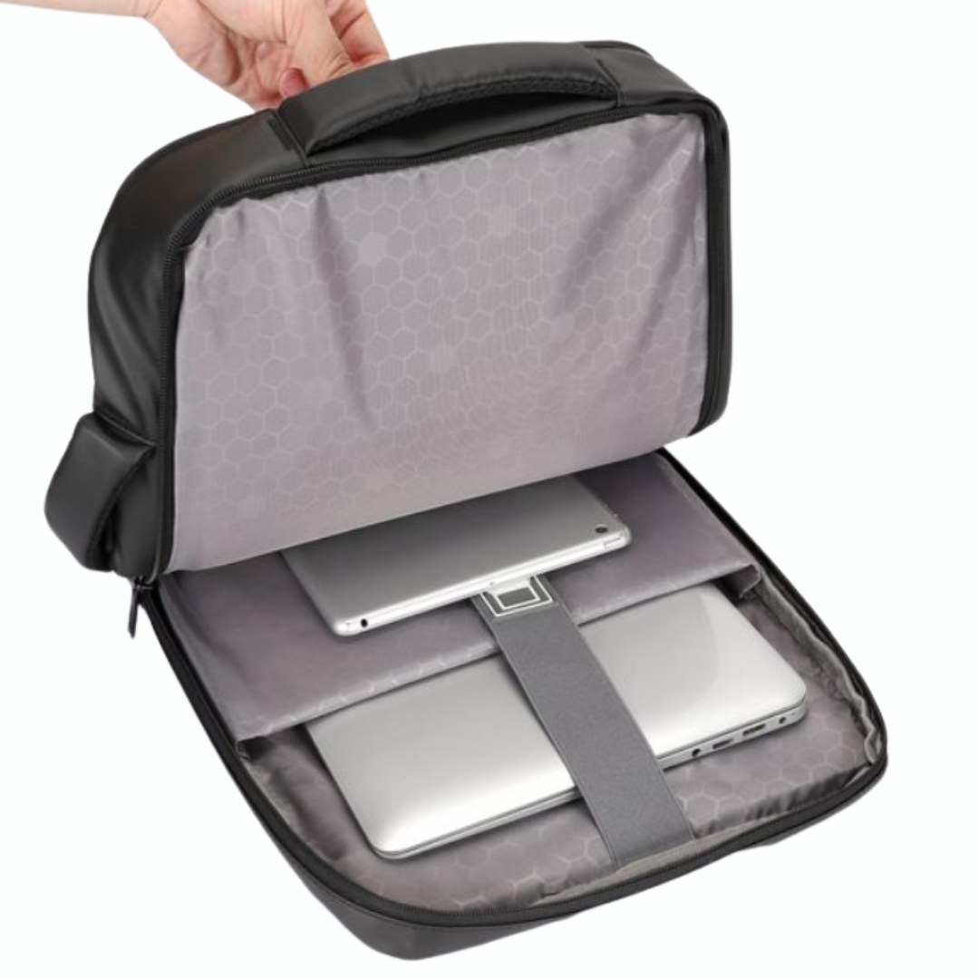
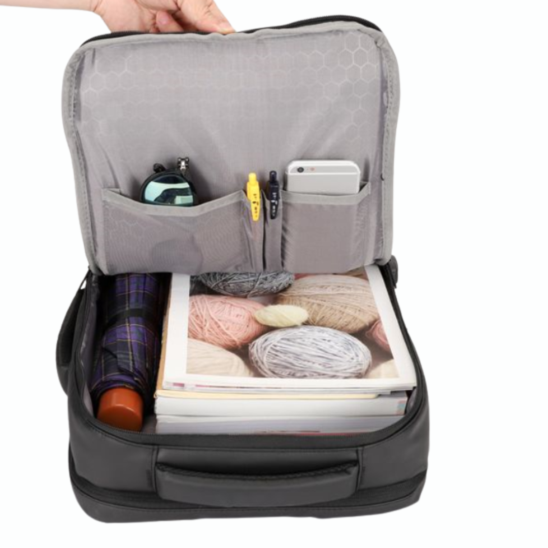
• חלוקת תאים פנימית לאחסון אביזרים, מסמכים ויומנים.
• תיק גמיש ונוח לאחסון מחשב נייד.
• ידית אחיזה מרופדת, חזקה ונוחה לנשיאה ולהרמה.
• כניסת USB בחלקו החיצוני של התיק ויציאת USB בתוך התיק להטענה נוחה של מכשירים.
• עשוי מבד פוליאסטר חזק במיוחד, דוחה מים.
• עיצוב עכשווי, מתאים לגברים, נשים ונוער.
• צבע: אפור
@media (max-width: 600px) {
.bag-related-row { flex-direction: column !important; gap: 15px !important; }
.bag-related-row a { width: 100% !important; }
}
אולי יעניין אותך גם
Your email address will not be published. Required fields are marked *
Please login to write review!
Looks like there are no reviews yet.